Responding to User Input Part One
For this section's project, we will begin work on a small sequence of forms that we will finish out in the next section. The starter repository for this project is located here. As usual, we will begin by forking the repository on GitHub into our own account, and then cloning the repository to wherever we are doing our development. Once we have the project cloned into our development environment, we are ready to get started.
Review the Requirements
As with all of our projects, we begin by reviewing the README.md file in the root of the repository. This file will tell us the requirements we must fulfill in order to successfully complete this project. For this first part of the project, we will focus on the requirements outlined for the Home.vue file. We will finish the remaining requirements in the next section of the book (Routing and URLs).
In its entirety, this project asks us to create a couple of forms and move the user through multiple locations in the application to complete those forms. For this first part of the project, we will focus primarily on creating and validating the sign up form. When the user provides valid data, we will display a success message. If the user provides invalid data, we will display an error message.
The Basic Requirements for this project are broken into requirements for each of the files. Stretch goals are provided that apply to all of the work in this project. We are encouraged to push this experiment as far as possible, so adding or altering form fields, adjusting validation logic, and providing more textured error messages are all fair game for stretching this project in this section. (But remember, to fully complete the project we must complete the second part in the Routing and URLs section.)
Introduce the "views" directory
You'll notice that our Component files are located in a views directory. This is because we will be using these components represent routable views and we'll be using a router in the second half of this project. It is a convention in Vue.js to put Components referenced by the router into a views directory instead of the componentents directory. Not all components are routable and this will become more clear in future projects.
Here are the Basic Requirements relevant to this first part of the project:
In the src/views/Home.vue file
- Create a form for the user to sign up to the site
- Use
v-showto toggle between the sign up form and the success text - Use the
submitevent to trigger thevalidateFormmethod on the component - Validate the form according to the rules in the
Home.vuefile - If the form is valid, show the success message; if not, show a warning message on the form
Working the Project
To begin working on the file, it is necessary to install our dependencies (by running npm install inside the project repository), and then we will want to run our development server (by running npm run dev inside the project repository). Once we have the project running, we will see this in the browser:
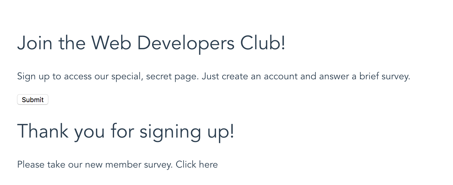
Home view
Work on this part of the project will happen in the src/views/Home.vue file. This file contains the Home component, which controls the first page of our project website. In the initial state, the view contains no form input fields and it shows the success message right away. We must fill in the details to make this a functioning sign up form.
Show/Hide Form and Thank-You Message
We begin with a set of data defined in the component's data object. One of those data values is showForm, which is set to true by default. The first TODO in the file tells us to modulate the display of the form container (<div class="form-container">). If we glance down a little further, we can see that we also need to modulate the display of the <div class="success-message"> element, which contains the success message the user should see after successfully submitting the form. We can tackle both of these TODOs at once.
First, we can add a v-show directive to the <div class="form-container">:
<div class="form-container" v-show="showForm">
If showForm is true (which it is at the beginning), this form container will be shown. Remember that v-show accepts a conditional statement, so we can use conditional operators with the v-show directive, too. We will do that to hide the success message until the right time.
In order to handle the show/hide of the success message, we can add another v-show directive to that element:
<div class="success-message" v-show="!showForm">
In this case, we want to show the success message when the form is NOT showing. Essentially, the success message is the opposite of the form container. We use the !showForm syntax to specify that when showForm is false, this element should be shown. Once we implement these two v-show directives, we should see that the success message is hidden by default:
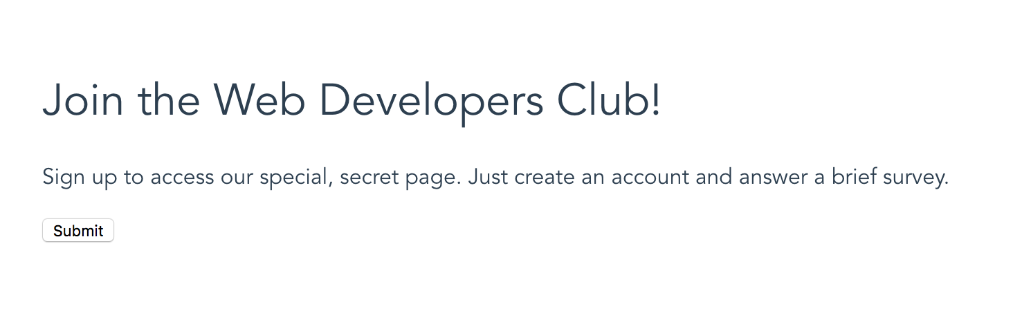
Hiding the success message
Create Error Message
The next TODO we come across asks us to make an error message and use v-show to make it appear when the form has an error. First, we must add the element that we will modulate. If we glance at the styles defined in the Home component, we can see there is a class defined to style an error element: .error. We will use that class and add the following to the component template:
<p class="error" v-show="showError">Please check the information you have entered. Be sure to fill in all fields.</p>
By default, this warning will not show up. In order to complete our work here, we must alter the showError value in the component to be true. If we just adjust the value where it is defined in the data object we can see the error message:
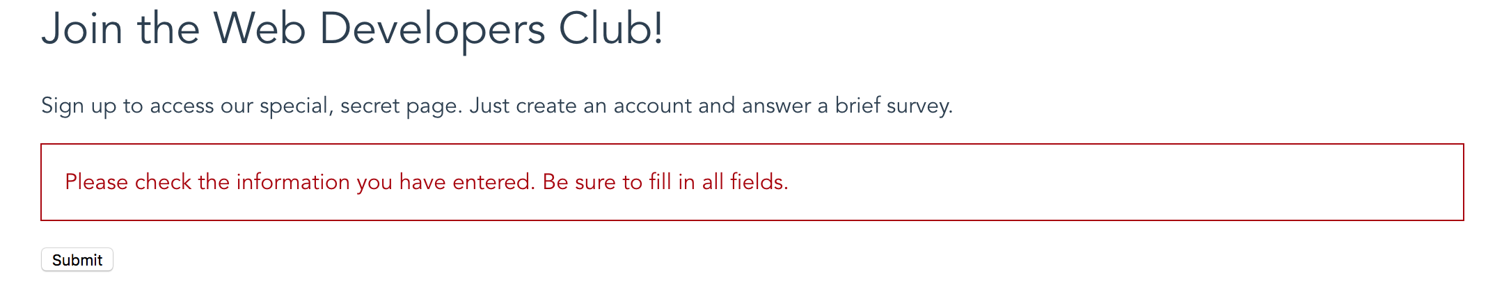
Error message displayed
Now we can reset the initial value of showError to be false (we don't want to show the error when the user first arrives on the site), and we can alter the value in the validateForm method accordingly.
Form Submit Event Handler
Next, we want to set up the event handler for the form submission event. To do this, we will modify the <form> tag and add a v-on directive. This will be very similar to the examples we saw earlier. Here is what the <form> tag looks like after we've added the handler:
<form v-on:submit.prevent="validateForm">
Notice that we have used the .prevent modifier with the v-on directive. This modifier will prevent the default event handlers from firing in the browser when the form is submitted. If we fail to add this, the page would refresh each time the form is submitted and we would never be able to process any data. By using .prevent we tell the browser to stop processing the event, which allows us to handle the event with our validateForm method, which we will modify later on. For now, we can move on to populating our form with input fields.
Add Input Fields
The next set of TODOs ask us to create inputs for each field in our form. These fields must be properly bound to a value in the component data object, and they should use appropriate labels. This is what things look like after we've made the edits:
<p>
    <label for="username">Username
        <input type="text" id="username" v-model="username">
    </label>
</p>
<p>
    <label for="email">Email
        <input type="email" id="email" v-model="email">
    </label>
</p>
<p>
    <label for="password">Password
        <input type="password" id="password" v-model="password">
    </label>
</p>
<p>
    <label for="passwordVerify">Verify Password
        <input type="password" id="passwordVerify" v-model="passwordVerify">
    </label>
</p>
Notice that each input in this form is has a specific value in the type attribute. The username is a text input. The email is an email input. And the password fields are password inputs. Properly labelling the type of input fields is crucial for providing a good user experience and for collecting valid data.
Each input field uses the v-model directive to set up the data binding between the inputs and the component logic. These v-model attributes must match up with the values specified as part of the data object. Once we've got this set up, we are ready to move on to writing our validation.
Validating the Form
Whenever a form is submitted by a user, it's essential to perform some sort of validation process. This is done to make sure the information that has been submitted meets our needs and that no required fields have been left blank. There are many ways to validate data, but for the purposes of this project we are just looking for a simple validation that makes sure there is information in every field and that the values of password and passwordVerify are equal. (Feel free to create more complex validation logic in pursuit of the stretch goals below.)
We already have a validateForm method defined in our component logic. In order to perform real validation, we must add code inside this method to access all of the input field values, analyze them, and then respond accordingly. This sounds complex, but really we are talking about some form of conditional. (Again, feel free to explore different approaches here, but what follows is one way of accomplishing this goal.)
methods: {
    validateForm: function () {
      if ((this.username != '') &&
          (this.email != '') &&
          (this.password === this.passwordVerify)){
        // Form data is valid, so turn off the form to show the success message.
        this.showForm = false;
      } else {
        // Form data is NOT valid, so show the error message.
        this.showError = true;
      }
    }
}
The validation rules we must enforce are:
usernameis not blankemailis not blankpasswordandpasswordVerifyare equal
The example above uses a simple series of conditional statements to check that all three conditions are met. If there is a problem with any of these fields, the validation method will cause the error message to show by setting showError to true. Here is what that looks like in the browser:
Error message
If all of the conditions pass, then the form is hidden by setting showForm to false. This also has the effect of showing the success message, which looks like this:
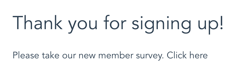
Success message
Currently, the success message contains a TODO asking us to add a <router-link> tag to link to another page in our application. We will continue this project in the next seciton and add that tag. For now, though, we have finished this project. We should be able to fill in the form with valid data and see the success message. When we submit invalid data (omit a field, or submit mismatched passwords), then we will see the error message.
Wrapping it Up
Once we have made all of our changes to the src/views/Home.vue file, it should look something like this:
<template>
  <div class="home">
    <div class="form-container" v-show="showForm">
      <h1>Join the Web Developers Club!</h1>
      <p>Sign up to access our special, secret page. Just create an account and answer a brief survey.</p>
      <p class="error" v-show="showError">Please check the information you have entered. Be sure to fill in all fields.</p>
      <form v-on:submit.prevent="validateForm">
        <p><label for="username">Username <input type="text" id="username" v-model="username"></label></p>
        <p><label for="email">Email <input type="email" id="email" v-model="email"></label></p>
        <p><label for="password">Password <input type="password" id="password" v-model="password"></label></p>
        <p><label for="passwordVerify">Verify Password <input type="password" id="passwordVerify" v-model="passwordVerify"></label></p>

        <p><input type="submit" value="Submit"></p>
      </form>
    </div>
    <div class="success-message" v-show="!showForm">
      <h1>Thank you for signing up!</h1>
      <p>Please take our new member survey. Click here</p><!-- TODO: Link "Click here" to the survey page. -->
    </div>
  </div>
</template>

<script>
export default {
  name: 'Home',
  data () {
    return {
      username: '',
      email: '',
      password: '',
      passwordVerify: '',
      showForm: true,
      showError: false
    }
  },
  methods: {
    validateForm: function () {
      if ((this.username != '') &&
          (this.email != '') &&
          (this.password === this.passwordVerify)){
        // Form data is valid, so turn off the form to show the success message.
        this.showForm = false;
      } else {
        // Form data is NOT valid, so show the error message.
        this.showError = true;
      }
    }
  }
}
</script>

<style scoped>
h1, h2 {
  font-weight: normal;
}
.error {
  border: 1px solid #aa0000;
  padding: 1rem;
  color: #aa0000;
}

ul {
  list-style-type: none;
  padding: 0;
}

li {
  display: inline-block;
  margin: 0 10px;
}

a {
  color: #42b983;
}
</style>
Build and Deploy
Once we've finished our work, we can build and deploy the project. This project has been configured to build to the docs/ directory, so we can follow the same pattern we used before:
- Execute the
npm run buildcommand to build the files into thedocs/directory. - Commit all of our code.
- Push the code up to GitHub.
- Go into the repository settings and set the GH Pages section to publish from the
docs/directory.
The project should now be up and available to the public through GH Pages.
Stretch Goals
There are many more fun things we can do with this project. The README.md file lists several possible stretch goals:
- Enhance the sign up form to collect additional info, different info, or to use different input types to collect the data
- Enhance the validation to be more specific (e.g. verify no numbers in the name, or there is an
@and a.in the email address, etc.) - Enhance error messages to be more specific (e.g. build a message that mentions which field is causing the problem)
There are many other ways we could push this forward. Feel free to explore and experiment with forms and methods to handle user input. Keep pushing, and have fun!