wats3010-project-1
Project 1: Travel Blog
Design
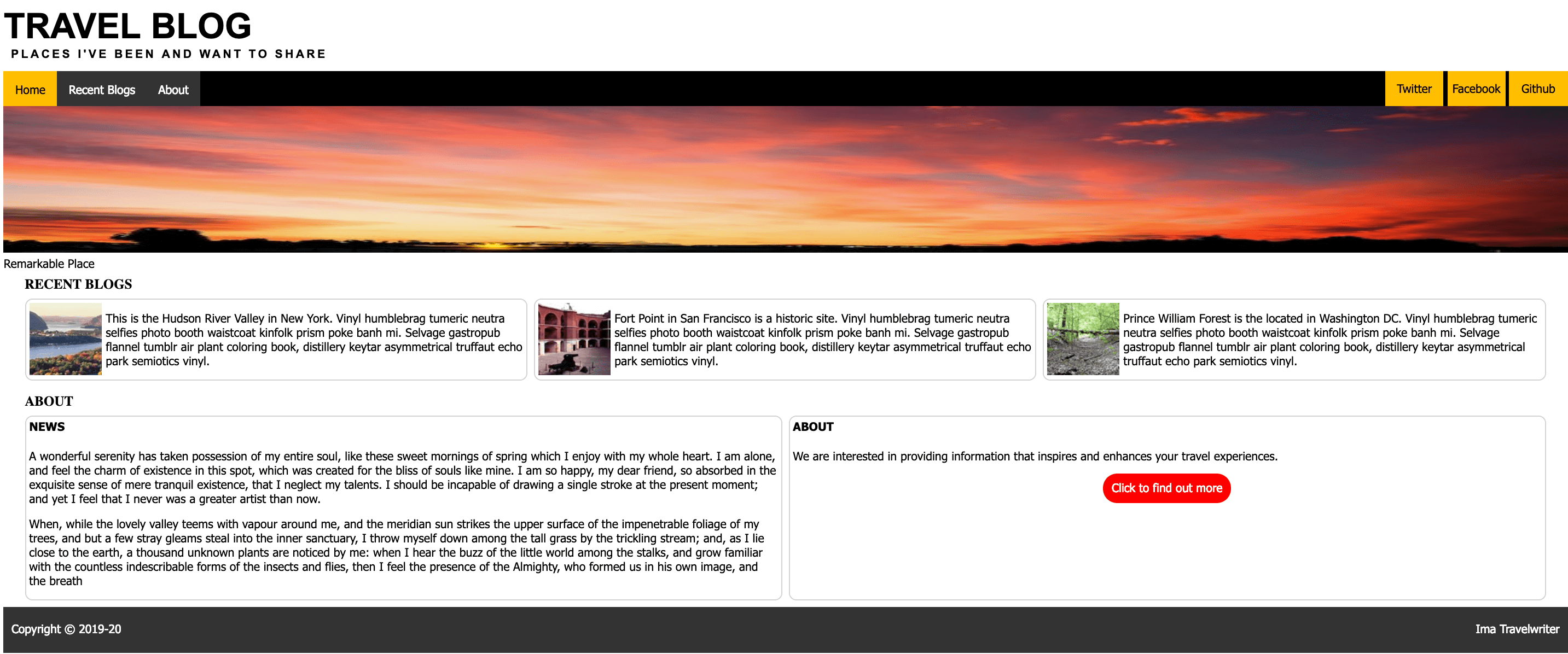
Comp
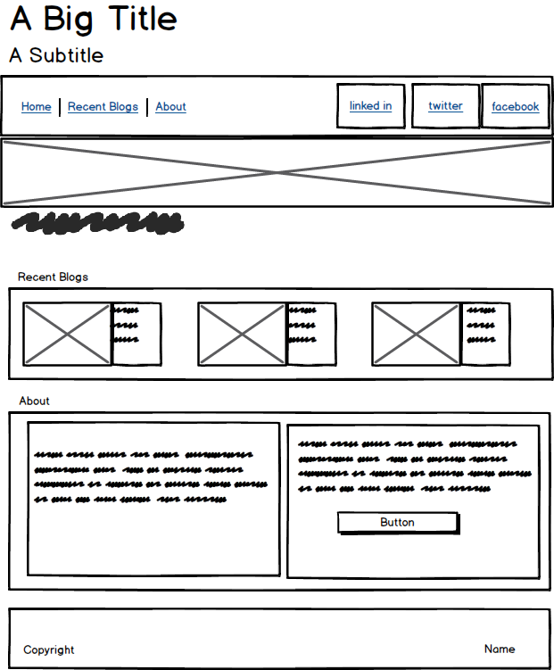
Wireframe
HTML
-
Create files: index.html and css/style.css. Use VS code to generate default html in the index.html file (hint: use !
in VS Code.). Link CSS file into the html. Add a meta tag to specify you as the author `` -
You can find all content in the files located in the content directory.
-
Code the semantic html to provide document structure:
header Home
nav
figure
main
—- section Recent Blogs
—- section About
footer - Add head tags to the
headerelement and supply the title and subtitle using content from the titles-captions.txt files. - Add 2 div tags within the
navelement. Add an unordered list tag (ul) inside each of the div elements. The list on the left should contain list items (li) with content and links (a) to Home, Recent Blogs, and About. These will be linked to internal links. The list items on the right should contain links to “Twitter”, “Facebook” and “Github” and will be external links. - The figure element should contain an image (
img) and a caption (figcaption). The image source is “images/backlit-clouds-dark-831x200.jpg” and the caption is in the titles-captions.txt file. - The Recent Blogs section will use a CSS Table layout using 1 row and 3 columns.
- First add a head tag with the word “Recent Blogs” to describe the section.
- Add a div tag for the row and 3 child divs within the row to represent the 3 columns.
- Within each column add an image (
img) and a paragraph (p). The images can be found in the images directory and the content for paragraphs in the recent-blogs.txt file. The order of the images is : hudson-river.., fort-point…, prince-william….
- The About section will use a CSS Table layout using 1 row and 2 columns.
- First add the a head tag with the word “About” to describe the section.
- Add a div tag for the row and and 2 child divs within the row to represent the 2 columns.
- Within each column add a head tag with a paragraph. The head tags should contain the words “News” and “About”. The content for the news and about paragraphs are in the correpsonding content directory files. There are 2 paragraphs in the News Section.
- Within the div tag representing the column for “About” place a
divtag that will by styled to be a call to action (CTA) area with a childbuttonelement and make it’s content “Click to find out more”. - In the footer section add 2 div tags to represent the left and right contents of the footer. The contents of the left should contain the copyright information
Copyright © 2019-20and the contents on the right should contain your name. - Internal Page Links: In order to support internal navigation add id attributes to head tag for the Recent Blogs section and the head tag for the About section. Then use these id’s in the page links section of the nav element by assigning the
#<id>to thehref. You can set the home linkhrefto#string to cause the page to go to the start of the document. Test this out by clicking on these links. - Add a favicon using the
t.pngfile in images directory.<link rel="icon" type="image/png" href="images/t.png"> - Add the main title from title-captions.txt to the title tag in the head section.
CSS
- Normalize the styles (overrided default browser styles)
- set body height to 100%
body { height: 100%; } - use the
*selector and set box sizing to border box ``` - { box-sizing: border-box; } ```
- set margin and padding to 0, line-height to
1.2 emand text transform to uppercase on allheadtagsh2, h3, h4, h5, h6 { margin: 0; padding:0; line-height: 1.2em; text-transform: uppercase; } - add some padding around the h4 header
h4 { padding: 5px; } - set
ulmargin and padding to 0ul { margin: 0; padding: 0; } - set
mainmargin top and bottom to 0 and left and right to 20pxmain { margin: 0 20px; } - set
ppadding top and bottom to 0 and left and right to 5pxp { padding: 0 5px; }
- set body height to 100%
- Typography
- style the h1
h1 { font-family: Arial, Helvetica, sans-serif; margin: 0; font-size: 3rem; } - style the h2
h2 { font-family: Arial, Helvetica, sans-serif; margin: 0; padding: 0 10px 15px 10px; letter-spacing: .2rem; font-size: 1rem; } - provide a font for other text enclosing elements
p,
 nav,
 div,
 a,
 figcaption,
 span {
   font-family: 'Segoe UI', Tahoma, Geneva, Verdana, sans-serif;
 }
- style the h1
- Page Links (nav bar)
- create a class called
page-linksand assign it to theulthat contains the navigation internal links. - style the
ulso that it will clear the floated elements inside itul.page-links { list-style-type: none; margin: 0; padding: 0; overflow:hidden; background-color:#333; } - style the list items so that they float left
.page-links li { float: left; } - style the anchor tag text and alignment and remove the underlines
.page-links a { display: block; background-color: black; color: white; text-align: center; padding: 14px 16px; text-decoration: none; } - style the hover of the anchor tags
- create a class called
  .page-links a:hover {
    background-color: gray;
    color: white;
  }
  - add a class active to the home link and style that
  .page-links .active {
    background-color:#ffbf00;
    color: black;
  }
- Social links (nav bar)
- create a class called
social-linksand assign it to theulthat contains the social links. Usedisplay:inline-blockon the list itemslito cause them to layout horizontally following the pattern in the Skills 1-4 Layout Horizonal assignment. - Set list style type to none to remove bullet points and then set height and line-height in the
ulto 48px, so that the text will center vertically.ul.social-links { list-style-type: none; /* trick to getting text to center */ /* set height = line-height */ height: 48px; line-height: 48px; }
- create a class called
- The list items should all be equal in width (
5rem) with a background color of#ffbf00and centered text alignment..social-links li { display: inline-block; width: 5rem; background-color: #ffbf00; text-align: center; }
The social links a tags should have black text and remove the default underline with text-decoration: none.
  .social-links a {
      color: black;
      text-decoration: none;
  }
On hovering the a’s the text should be white and hovering the li’s the background color should be gray.
    .social-links a:hover {
        color: white;
    }
    .social-links li:hover {
        background-color: gray;
    }
- Nav bar positioning: the Page Links and Social links to appear on the same line in the nav
- use
position:relativeon thenavin order to applyabsolute positioningon the children (page links and social links) See the Skills 1-4 Layout Horizontal assignment where the footer used absolute positioning to move contents to left and right for example - the nav should be 48px with a black background
nav { position: relative; height: 48px; background-color: black; } - assign the
divthat contains the page links a class ofnav-leftand thedivthat contains the social links should be given a class ofnav-right - apply
position: absoluteto bothnav-leftandnav-right nav-leftwill be positioned atright:0, top:0andnav-rightwill be positioned atleft:0, top:0``` .nav-right { position: absolute; right: 0; top: 0; }
- use
.nav-left { position: absolute; left: 0; top: 0; }
6. Big Image Figure: set the margin to 0 on the figure and set the width to 100% and height to 200px. This ensures that the image covers the full width of the page no matter how big the window is.
.big-image { margin: 0; }
.big-image img { width: 100%; height: 200px; }
7. Table layouts are used for both the Recent Blogs and About sections.  The table layout will be controlled by the number of rows and columns as well as the amount of content.
  - create a class named `table` and assign it to sections containing **Recent Blogs** and **About**.  Create a table class selector in the style sheet and give it the following properties and values:
.table { display: table; height: 100%; width: 100%; table-layout: fixed; border-collapse: separate; border-spacing: 10px; }
- create a row class and assign it to the divs that are direct children of the section elements and give them the rows the following style
.row { display: table-row; }
- create a `col` class and add the `col` class to any `div`'s that are children of the `row` class and then style the cols and `p` children with the following
.col { display: table-cell; border: 1px solid lightgray; border-radius: 10px; }
.col p {
    font-size: 1rem;
}  ``` 8. Float the text in the **Recent Blogs** section around the images by adding a `wrapped` class to the images and set them to `display:block` and `float:left`.  Add 5px padding. See the **Skills 1-6 images-float-text** for reference. ```   .wrapped {
  display: block;
  float: left;
  padding: 5px;   } ```
- Call to action button styling
- assign a
ctaclass to the div around the button and give it a width of11rem,margin:autoand center align the text.cta { width: 11rem; margin: auto; text-align:center; } - assign a
cta-buttonclass to the button and make it a block element with a heigth of40px, a line height of40px, a red backgound, white text andborder-radiusof30px.cta-button { display: block; height: 40px; line-height: 40px; background: red; color: white; border-radius: 30px; }
- assign a
- Footer
- provide a background color of ‘#333’, height of ‘4rem’ and text color white,give it a padding of 20 and position relative with a width of 100%
footer { background-color: #333; height: 4rem; color: white; padding: 20px; position: relative; width: 100%; } - create a
footer-leftandfooter-rightclass and assign them to the 2div’s nested in thefooter - set absolute position for both
footer-rightandfooter-left - set a property of
left: 0.50%onfooter-left - set a property of
right: 0.50%onfooter-right``` .footer-left { position: absolute; left: 0.50%; }
- provide a background color of ‘#333’, height of ‘4rem’ and text color white,give it a padding of 20 and position relative with a width of 100%
.footer-right { position: absolute; right: 0.50%; } ```
Test and Submit
- Bring up your page and test it
- Push your code to github.com
- Configure hosting to github.io in the repository setting tab
- Browse to your hosted code
- Copy the link into the description area of your repository
- Validate and fix errors using HTML and CSS Validators
- Submit 2 URL in Canvas: one from github.com and one from github.io